Monday, 22 June 2009

sanctuary

we got set a theme which was sanctuary
I looked in to the word sanctuary to find the meaning :
(a sacred place;a consecrated spot;a holy inviolable site)

I stated of this project by making a mind map to help me with some ideas i had
  • holy spot - church, (place of worship)- religion -God
  • special spot - bedroom (place you feel safe ) -with freinds/family/loved ones
  • somewhere you feel relaxed (holiday)
religion

love

a luxury spot

some images i took


picture of the clean,still , blue water in thiland

i felt i could develop the idea of a place of worship the most and i could go in to the most detail with it so i started to look at religious things


images of a church with a pencil sketch of the church


i then started to look in to religious symbols in alot more detail


  • cross/crucifix
  • fish
  • dove
  • holy spirit
  • religiouse beeds

images of crusifixes and croses primary and secondery sourced
on the over paige artist research

  • leonardo de vinci - the vitruvian man
  • albrecht durer - praying hands
    An etching combing -
    churches
    relgiouse beeds
    crucifix
    fishwords from the lords prayer (FATHER,HEAVEN,GIVE)


something i liked in the etching was the text because i felt it stuck out and even thou there wasent alot of wrighting single words can be more effective so i started to look more at the lords prayer thinking how i could combine it in to my art
one of my ideas was to take words out of the prayer like( give us this day our daily bread) and put it on a bread packaging
hear are two of my ideas i had :


i then got the idea to have a person standing in the cross postion with the lords prayer behind bleeding down like blood

i started to look at artists which had drawn people in a cross postion or on the cross

seen on paige (1)

grafiti art
painting done in water colours


i then looked at some art done by Francis Bacon, i looked at Francis Bacon because i think his work is reali dark and gothic and that the way i wanted to go with my work


a pencil scetch or someone in the cross postion

i like the way i hve cought the light in diffrent spots by using a ruber to high light the light


i then took a few photo images of myself and freinds in cross shape postions

when looking for images once i came apon a image of a person in the cross postion with a black back ground this made me think of the nike adverts

i like the way the image is on a black background because it makes the image bold and stand out wich i think is reali effective

i then coppyed the idea by designing my own on photoshop by

  • getting the pictures i took
  • scanning them in
  • changing them in to negative
  • and dropping the image on to a black background
  • i then added some text
  • i either added a quote/the lords prayer

i then tryed out some text and a image on diffrent kind of papper which i had done stuff to

  • burnt
  • stained with coffe
  • stained with tea

i tyed this to find out which gave me the best effect

my finale peice

  • old bible pages painted over with coffe to look older
  • black and white image of a photo i took
  • the lords prayer in the background bleeding down

after i had finnished my finale peice i decided to have my peice of art hanging outwards to give it more of an effect of some1 getting hung

so i put a bolts in both hands like a nail on a crucifix and had chains connected so know my work hangs so you look up at it

Tuesday, 3 February 2009

identity

For this art project I am studying identity :

"State of being a specified person or thing"

I started of by making a mind map of different ideas I felt I could develop,
I had five starting points from which to progress.


  • Nanny state -Government - Schools/Workplace - Social
  • Police - CCTV - Satellite/Surveillance - Big Brother/ 1984
  • Passport - Driving License/Identity Cards/Credit History - Fingerprint/DNA
  • Peoples perception - Religion/Race/Colour - Dress/Age/Hairstyle/Size - Body art (Tattos,Piercings)

I then used a few ideas from the cover graphics of films


I found in both of the pictures that they had similarities;
The first film used a hand print and the second film had fingerprints which I thought were both similar.
In the second film they use images which I think look like CCTV footage and they use a target which I thought could represent you when you are being watched (Big Brother).


So my idea in the project was to do something which was related between
Big brother and fingerprints

I looked at some images which represent big brother


I also looked at some security images which I thought was related


I then started to design my own work :
The first piece I did was a mixture between my hands and the big brother eye which I photocopied giving an effect that the hands and the big brother eye were coming out of a black background and made them stand out
I tried many various designs which gave me a lot of different results.

one of my was designs:


My second piece of work was a mix between pictures (CCTV), photocopies (hand & big brother logo) and writing (facts)
I think this piece of work would be good as a poster, it stands out and is eye catching. Something you would see as you walk down a street.


For my third piece I did an etching of my hand, with the big brother eye superimposed over the top of the hand which was linking both of my ideas.
I like the final result but I think I didn’t put enough detail into the big brother eye compared to the hand which has a lot of detail.


After doing the etching of the hand I started to look into putting more detail in the hand and fingerprints
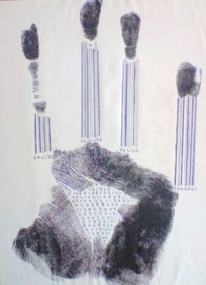
I decided to do a print of my hand, I had to do the print 2 times because the first time I put to much paint into it and you couldn't’t see any of the lines in the hand.


The second time I did it with less paint, which made the detail stand out, you could see all the different and unique lines in the hand


When looking at all the lines up close in the fingerprint it is like looking at a bar code, which in many ways is true because every bar code is different and can be traced which is the same as a fingerprint.
In a few of my pieces of work I have included numbers and lines to represent bar codes.


The next thing i did was do the different stages of a hand -
skeleton
muscles
skin
futuristic


The photocopy's of the hands and the big brother logo I decided to experiment with different art materials
watercolour
acrylic
pastels


I also did it in acrylic but felt it didn't turn out as well as I would have liked it to because it wouldn't blend as well as the water colour
I think the water colour image turned out the best quality

a few or the artists i looked at were -


esher
da vinci


A pencil drawing and an etching both of escher


Towards the end of the project i started to mess around on photoshop with some ideas i had for the hand
i took the images i had of the handprint and scanned them in to the computer i then over layed diffrent images:

(rugby pictures)


(family)